Blog
Golden Rectangle in Design
Apply golden rectangle proportions in web design, logos, UI modules, and photography without guessing aspect ratios.
By Golden Rectangle Calculator Team
Blog
Apply golden rectangle proportions in web design, logos, UI modules, and photography without guessing aspect ratios.
By Golden Rectangle Calculator Team
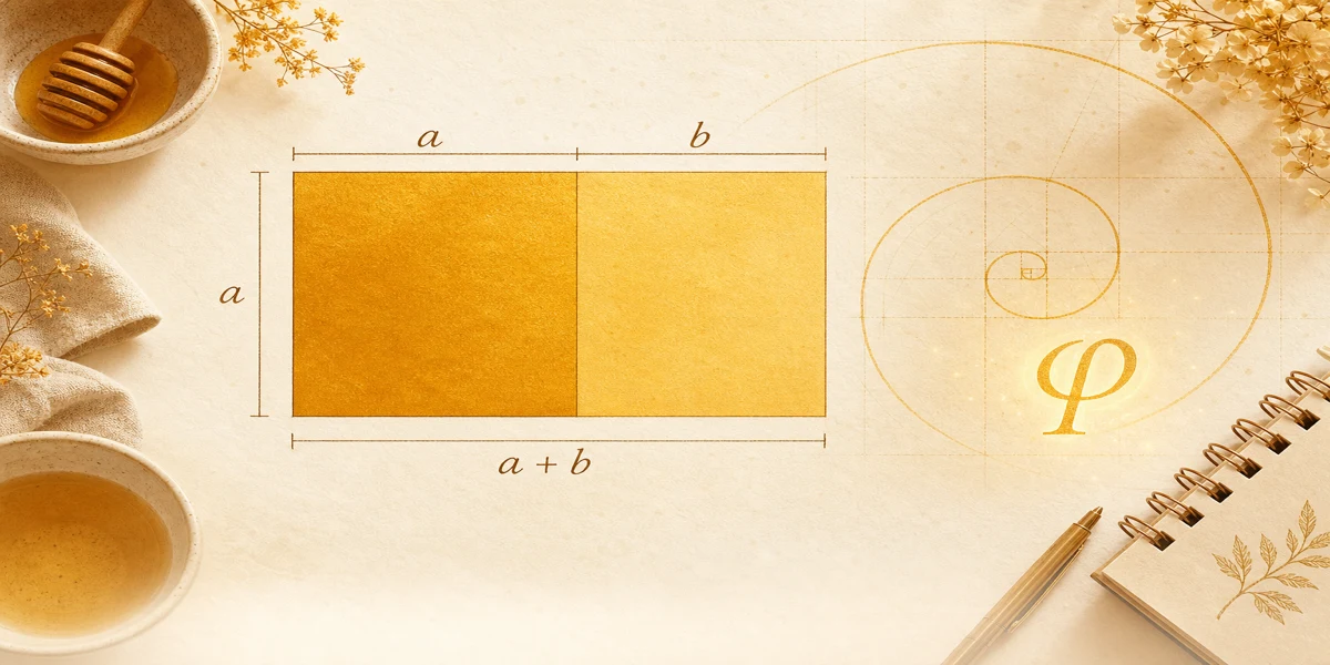
Set height a and width a + b using φ. The Golden Rectangle Calculator converts your base module to golden width and area.
Formula
This guide shows how designers use the same math as the Golden Rectangle Calculator when they want calm, balanced frames.
Golden guides complement spacing systems; they do not replace accessibility or type scale rules.
Start from a real module: button row height, card image, or hero short side. Call that a.
Compute width with φ before you polish padding and gutters.
φ sits between 1 and 2, so golden modules feel wider than square tiles but not as wide as cinematic banners.
Logos inside a golden box leave predictable margin bands for wordmarks and icons.
Photography can place subjects on internal lines, but the frame itself should come from measured a and a + b when you want true golden proportion.
Browse {{linkA}} for pixel and millimeter starting points before you lock a grid.
Hero height a with width a + b is the most direct translation of golden rectangle math into CSS max-width.
Inside the frame, you can still use 8-point spacing; golden proportion answers outer proportion, not every margin.
When stakeholders change only width, rerun the {{linkB}} instead of eyeballing 1600 px.
From brief to inspectable CSS values.
Content block height a = 720 px. Golden total width ≈ 1165 px. Compare with a 1280 px arbitrary width to see subtle proportion shift.
Strip b ≈ 445 px if you split the width visually into square plus strip for teaching slides.
Confirm numbers in the calculator.
Pair with responsive breakpoints so the ratio holds when the module scales down.
Design golden rectangles by fixing a real module and solving width with φ.
Treat φ as a proportion tool inside broader systems, not a override for all spacing.
Use the calculator during critiques to show exact targets.
Golden rectangle and Fibonacci sequence: how ratios approach φ, exact side math vs integer pairs, and checks with our free calculator.
Golden rectangle vs golden ratio: how φ differs from labeled sides, when to use each idea, and ties to the free dimension calculator.
Golden rectangle construction with compass and straightedge. Link classical steps to a, b, and φ, then check values on the free calculator.